Santander is a financial services leader in Argentina and one of the 20 largest banks in the world. As a foundational part of their long term digital transformation process, in 2016 they became the first bank in the country to offer 100% digital mortgages. Here, we share the Tonic3 experience applying UX, design, and development for a Santander platform that generated more than 20,000 transactions in the first month.
If you are interested in UX and Development Services, let us know!
Client’s Background
As a full-service bank with options for savings, credit volume, payment methods, foreign trade, transactional services, and cash management, only in Argentina, Santander has 333 branches, more than 2.5 million clients, and 6,500+ employees. Thus, added to the natural difficulty of making improvements in a highly regulated industry such as banking & financials and the decision of investing in innovation by an enormous entity like Santander.
This doubles the challenge. Executing this incorrectly may affect different departments within the organization and may result in a great extent of losses. Consequently, a good quality job can have a tremendous impact on it.
Business Problem
As part of its global strategic digital transformation plan, Santander was aiming to have a 100% digital process for mortgage loans and reduce its request time by more than 30%. Therefore, traceability, portability, and the electronic file management for the requested loans were major targets for the whole project.
The offline version is already involved in many external and internal factors in the overall process. As for the new system, it was necessary to put into perspective the dynamics of the commercialization of mortgage loans, based on a WEB process, as well as to allow multiple stakeholder integration.
By achieving that, Santander would have become the first Argentine bank to digitize these transactions.
What we did
Our Tonic3 Team developed a multichannel tool that allows users to apply for a mortgage loan 100% online, where they can find and upload all the required documentation and follow up on the process from the website without having to attend a branch. In order to avoid any problems during the application operation, AI & Machine Learning was required to recognize official documents.
At the client level, we seek a simple, fluid, and interactive process through the website that involves loading all the data and documentation they might need such as IDs and scriptures. This way, the new system not only simplifies access for customers but makes organization easier for bank employees to order and follow the documentation. - These were tasks that historically took a lot of time to rework due to missing files.
In addition to efficiency, the new platform contributes to better customer service. It allows the bank employees to enter all vital information, schedule meetings for signing contracts, mortgages, and comparing quotations. As a prime example, one of the goals of the project was to guarantee the integration with multiple stakeholders, especially with the external actors. But of course, to be able to build a better system for all the individuals involved in its uses and processes, our experts needed first-hand feedback.
For this reason, numerous stakeholders participated in the whole process. This includes external actors such as bank clients, executives, real estate agents, appraisers, and notaries, and internal actors such as business teams, product owners, the legal and IT department, and branch offices.
.png?width=692&name=Dise%C3%B1o%20sin%20t%C3%ADtulo%20(6).png)
Platform Tonic3 UX Team built for Santander Bank
Our Team
In order to build a solution that meets all the clients’ requirements, Tonic3 put together a 6-talent team composed of:
- 1 UX Expert
- 1 UX Strategist
- 1 UI Design Expert
- 1 Tech Leader
- 2 Front End Engineers
How we did it
UX
Strategy and Discovery
We knew the success of this project relied on how well we could comprehend the needs of multiple actors involved in the Mortgage Loan Process. Tonic3 UX Team established a user-centered design approach, which was based on interactive workshops with our stakeholders to identify the main users, their needs, and pain points. To get a better user understanding, our research also consisted of 1-on-1 interviews with 5 target users to understand the old loan system and current bank processes.
It was quite a challenge to coordinate the collaboration of all of them, but together with the Santander C-Level sponsorship and support and the implementation of our proven discovery studio method, we were able to form open and smooth communication into a real thing. As a result, it allowed our team to shift from assumption-based decisions to decisions that are guided by strategic insight.
Information Architecture and Usability Testing
From the insights we gained from potential user interviews and research, we could map interactions, making it clear how customers were going to utilize the banking product. We delivered a representation of the structure of the system, its functionalities, elements, and actions required for each of them. Only then we were able to design prototypes, sketches, wireframes, and to test them with the users.
In general, usability testing is important for bringing a concept to life because it offers insights into how satisfied users are with the product, reduces risk before the development of a successful product, ending an enhanced user experience. In this particular project, usability testing became crucial as it helped us identify problem areas within, which was not obvious beforehand and could have cost money to our client.
Finally, our UX team was equipped for high-fidelity prototyping before advancing into development.
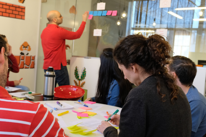
 Tonic3 UX Team working on Santander Bank platform
The framework of the process
Working under Agile using Scrum methodology in 2-week sprints making bi-monthly demo releases, led to Scrum rituals such as daily check-ins, sprints, planning, reviews, and retrospectives, which have become a vital part of the process.
One of the solutions to making these ceremonies as productive as possible was to set a Sprint 0 which is known as “the-project-before-the-project.” This step usually helps the development team come together to build a minimal number of user stories, project skeleton, story mapping, and develop a workable product.
In this particular project, it was transcendental to work with DoD (Definition of Done), in order to be able to decide when each activity was completed. It gave all members of the team a clear idea of the work ahead of them and dismissed possible obstacles that could have affected the success of the cycle of Sprints.
Based at our offices, the two front-end engineers effectively communicated and worked hand in hand with the Technology Team of Santander, to integrate the code to the infrastructure of the client, adding efforts and ensuring a better end result. This is why we truly believe teamwork is a necessity in any project.
To do all this, our Team worked with several tools and technologies, such as Angular, Github, TFS, and User Testing.
Duration
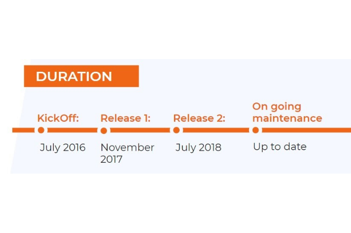
The KickOff of the project started in July of 2016. We launched the first MVP in November of 2017 and the second release in July of 2018. Since its launch, we kept progressively working until 2019 in an agile way to continue improving the overall experience by facilitating the use of the tool and optimizing all its processes.
Since the second release, our goal was to understand and improve the level of user satisfaction in regard to the use of the platform, shortening the time on task, and distinguishing if the system adjusts to the current needs of the users. We kept working in a process of continuous product improvement which was adding functionalities that assist the user with their daily tasks, interpreting new business needs, finding new pain points, and suggesting ways to improve.

Outcome
Tonic3 delivered this new platform and as a result, more than 20,000 transactions were made for the first month as well as 20 new requests each day.
According to User’s feedback, the new simple, fluid, and interactive system was widely accepted by the internal and external users.
By that, Santander became the first Argentine bank to offer 100% digital mortgage loans and in 2018 was recognized as the best financial entity due to its digital innovation and the impact all these improvements had for their clients. Subsequently, in 2019, the bank partnered with us again to optimize the user experience on the system we had developed.
If you’d like to know how we could help you bring your idea into a product, we strongly suggest you access here and schedule a free consultation with one of our experts.

Technology leaders carry a heavy load during digital transformation work. There’s a need to create...
Innovate Customer Experience with XR
Understanding and adapting to customer needs and emerging...
A little over a year ago, we conducted a comparison between two market leaders in this article: "...