 Marion Decobert
UX Design vs. Service Design: What's the difference?
The field of design is fluid and flexible. It adapts to changes in forms and habits of use and consumption, and reflects cultural and political...
How to plan the behavior of a digital product? How to define how each element reacts? How to facilitate human-machine understanding?
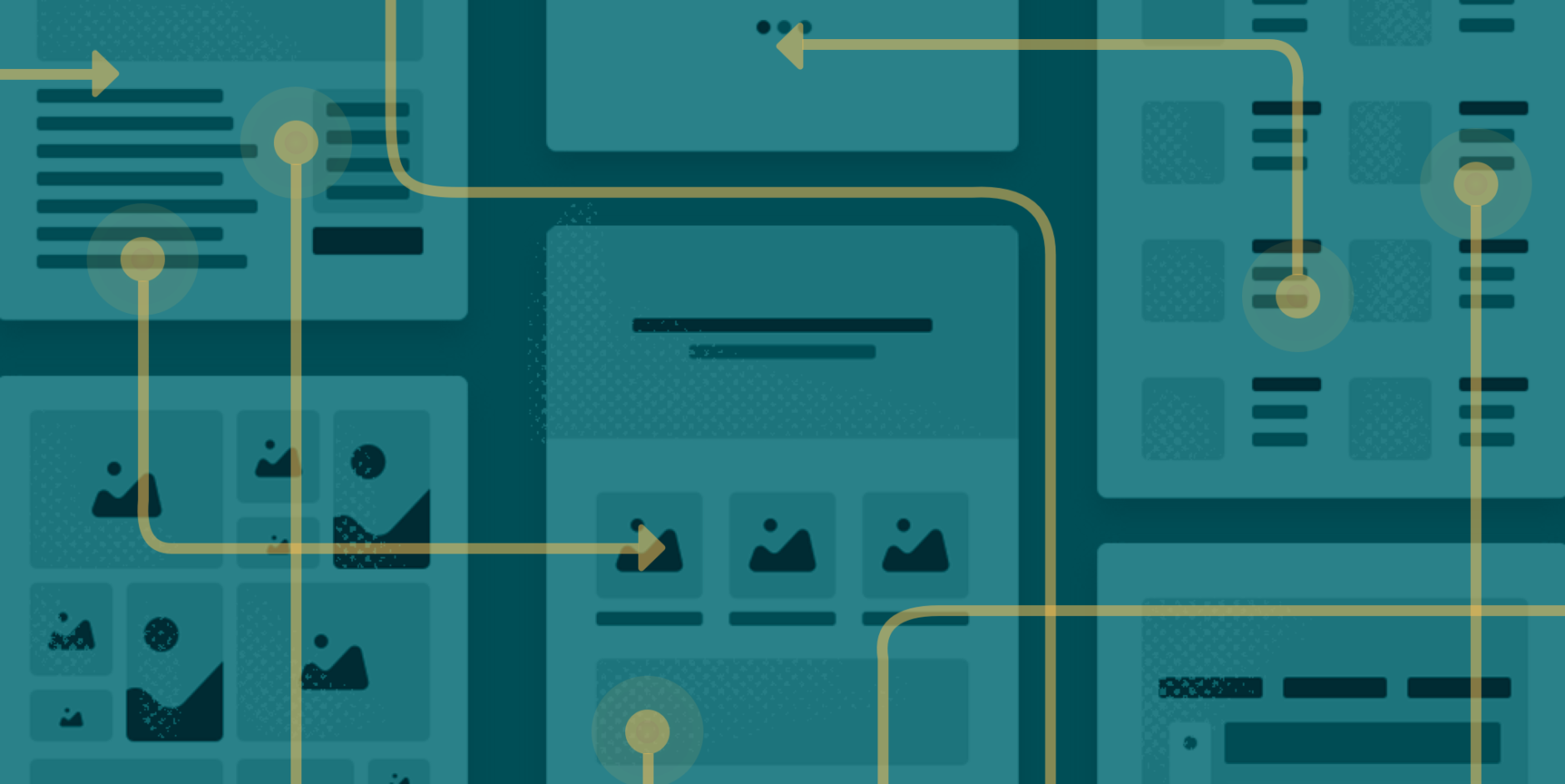
Interaction Design is the discipline that takes care of it.

Every time you double tap to like on Instagram, every time you move your mouse to select an icon on the desktop, every time you fill out a form and receive an error message, there was an interaction design.
Interaction design is a discipline that was born from the need to study and facilitate interactions between people and their environment.
Although interaction can occur with almost any physical object, in the digital world we associate it when we want to use a product or device to achieve a goal and we expect it to respond to our actions.
Interaction design, as well as usability, information architecture, and other disciplines, help us plan to deliver a good user experience.
Next I explain what it is about, its principles and best practices to create intuitive, friendly and easy-to-use products.
But first: Are you interested in Interaction Design? Let us help you and show you how you can improve your business with Design Techniques!!
The IxDA (Interaction Design Association), defines it as:
Interaction Design (IxD) defines the structure and behavior of interactive systems. Interaction designers seek to create meaningful relationships between people and the products or services they use, from computers to mobile devices, gadgets and more...
Usability.gov defines it as:
Interaction design focuses on creating well-thought-out interfaces to behaviors. Understanding how users and technology communicate with each other is fundamental to this discipline. With this understanding, you can anticipate how someone interacts with the system to correct problems early, as well as invent new ways of doing things.

Gillian Crampton Smith, introduced the concept of four dimensions to the interaction design language. Although each dimension works individually, it is the sum of all those that generate the best interaction between the user and the interface.
1st Dimension - Words: words must be easy to understand and allow interaction.
2nd Dimension - Visual representations: each graphic, illustration, diagram, icon, photo, etc. must be used with caution, but above all it must have a foundation. Avoid using it as decoration.
3rd Dimension - Space: what the user interacts with in the real world. These can be physical hardware objects like a mouse, pointer, keyboard, joystick, which are used as command tools.
4th Dimension - Time: refers to the duration that the user spends interacting with words, visual representations and space.
5th Dimension (proposed by Kevin Silver) - Behavior: which includes the emotions and reactions that the user has when operating, presenting, using or performing an action on the system.
To define this, it is necessary to establish if there will be any part of the hardware with which the user must interact with the interface (a mouse perhaps), or if it is with some gesture.
For example, if it were a mobile application, it might be necessary to define what finger actions cause what results.
On the other hand, if there were more advanced users, there would be commands that they could use to be more efficient and faster to control the interface.
An example could be commands as simple as copy / paste (Ctrl + C / Ctrl + V).
A button must look like a button, so it is important that the appearance of both color, shape, size, etc., demonstrate or give a clear clue that it can be pressed. In addition, it also tries to give some clues of what would happen if the user decided to continue, this may include a tooltip, a warning, or the labeling of the button itself.
For example, the following application gives hints on how to start using it.
A good interaction designer understands the importance of anticipating errors and designing so that users can prevent or recover from them.
A good example of how to do this is by limiting the actions that the user can take.
For example, if you have to fill in all the fields of a form, it would be good to mark as optional only what could be skipped, as well as deactivate the continue button, or use a timely validation in each field in order to know if it has been filled with right way or not.
But also, it will be necessary to clearly provide how the user could recover from an error they are faced with, so it is important to explain what happened, where, why and what should be done to correct or reverse it. action.
Twitter does well with Ajax when entering characters.
When the user executes an action, the system must respond by letting him know if it was effective or not, since not having feedback could mean two things: 1) nothing has been done yet (save, cancel) or 2) it has already been done. it did (and it might not).
For example, here in Mailchimp I tried to schedule the sending of a newsletter for the same day in the past hour, when it was actually for "tomorrow", so it showed me a message that it was not possible anymore that "it is impossible to travel in time."
Designing for the web, mobile or wearables is completely different. For this reason, it is essential to know the guidelines of each device and the best practices.
However, for example, the Fitts Law applies to everyone. Fitts Law refers to a model in which the speed and precision of a human's movement is taken into account to aim at a target.
In other words, how can we use our fingers or mouse to move successfully towards a button for example.
Fitts Law requires you to think strategically in some aspects such as:
Buttons and widgets must be appropriately sized. Be careful that they are not too small.
The most commonly used buttons should be closer to the cursor (or within fingertips for touch screens)
Visible menus are faster than using pull-down
Why do you think navigation options are used in the back of many mobile applications? Right, they are faster to reach.
Have you come across places where you have such a large number of options that you end up abandoning? This is due to Hick's Law, which states that the more options we give a person, the longer it will take to make a decision. Sites full of links or elements generally cause a disadvantage in terms of conversion.
Look at Yelp, who does it right by just giving a couple of options for the user to start their search.

The field of design is fluid and flexible. It adapts to changes in forms and habits of use and consumption, and reflects cultural and political...

Today, many factors are involved when interacting with a customer via a website.
Gestalt principles are principles / laws of human perception that describe how people group similar elements, recognize patterns, and simplify...