 Pablo Trapalla
The Human Touch: Why UX is ready to Lead the AI Revolution
From the days of hand-coded HTML in 1995 to today’s immersive AR/VR playgrounds and genAI explosion, at Tonic3, we've always been about using...
Gestalt principles are principles / laws of human perception that describe how people group similar elements, recognize patterns, and simplify complex images when we perceive objects.
Designers use the principles to organize content on websites and other interfaces to make it aesthetically pleasing and easy to understand.
Need Design for your company? Let us help you and show you how you can implement Design for your business!
"Gestalt" in German means "full uniform". The first principles of Gestalt were developed in the 1920s by German psychologists Max Wertheimer, Kurt Koffka, and Wolfgang Kohler, who aimed to understand how people typically get meaningful information from the chaotic stimuli around them.
They identified a series of laws related to the natural compulsion to find order within disorder. Therefore, the mind "informs" what the eye sees by perceiving a series of individual elements as a whole.
Professionals in the growing graphics industry quickly embraced these principles, and since then designers have widely used the Gestalt principles to create designs with well-placed elements that stand out with larger full images.
Although the Gestalt principles are commonly associated with psychology, they have also been used over the years to influence artists and marketers, helping them to understand how their audiences see and understand the images they create.
In fact, the use of these psychological teachings to evoke certain responses in buyers has been so successful that the Gestalt principles have become a foundational pillar of design. Within this new industry, these laws have evolved to take on new artistic and advertising-centric definitions:
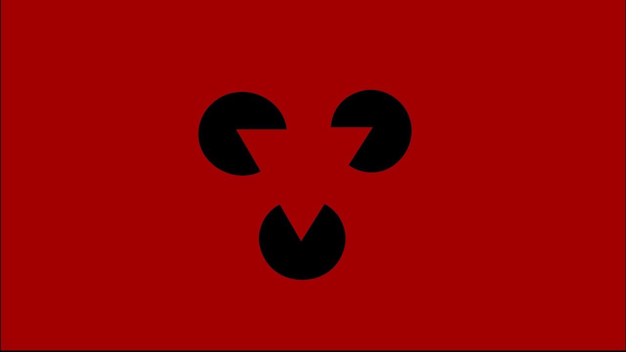
The principle of closure states that our mind is always seeking to finish incomplete images to create a whole, especially if that whole is something familiar. In a way, our mind is constantly playing a game of connect the dots to fill in the gaps and find meaning in the abstract.
Designers have often used this idea to create designs with hidden visuals and play with positive and negative space. For example, although the WWF logo is just abstract shapes, we naturally connect them to form a panda.
The principle of proximity states that elements which are grouped together are seen as related, or part of a larger whole. It may be that elements are simply close together or that they are separated by lines, colors, or other elements.
The Unilever logo is a good example of this, as it places a multitude of images close together to create the impression of a defined and united shape, which in this case is a letter.
Multistability, or multistable perception, is a principle that will be familiar to anyone who enjoys optical illusions. This idea plays off the fact that our brains tend to look for a stable element when something seems unstable.
This is a similar concept to looking at one spot while turning in circles to avoid getting dizzy. In design, this concept can be turned on its head to create seemingly changing and varied images using simple techniques such as positive and negative space, background and foreground, and color theory.
The Rubin vase is a good example of this; when you look at the image one way it appears to be two faces, but when it is looked at another way, it becomes a vase. A good example of this in a logo would be Toblerone, which has a mountain in the background with, upon closer inspection, the outline of a rearing bear in the foreground, hidden within the cliff’s design.
We group the closest items together and separate them from the farthest.
So when you group individual elements into an area or group of your layout, users will recognize it as a different unit from everything else on the screen.

An example of proximity in design is the Girl Scout logo with its three faces grouped together in the profile (two green, one white).
The law of symmetry and order is also called prägnanz, the German word for "good figure". This principle says that your brain perceives ambiguous shapes in the simplest way possible.
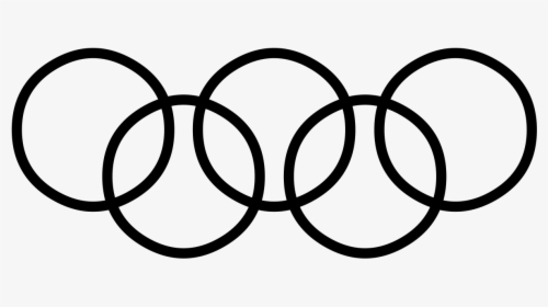
For example, a monochromatic version of the Olympus logo looks like a series of overlapping circles, rather than a collection of curved lines.
Although common fate was not initially included in the Gestalt theory, it has since been added. Its usefulness cannot be overlooked in UX design. This principle says that people group things that point or move in the same direction.
In nature, we see it in things like flocks of birds or schools of fish. They are made up of a number of individual elements, but because they seem to move as one, our brain groups them together and sees them as one stimulus.
This is very useful in UX as animated effects are more and more common in modern design. Note that the elements do not need to move to benefit from this principle, but they must appear to be moving.
The principles of Gestalt are of crucial importance in the design of user experience (UX). When designing user interfaces, users should be able to understand what they are seeing and find what they are looking for at a glance.
The principles of proximity and common territory are a good example, as shown on our landing page below. Colors and graphics divide the page into distinct areas.
Without it, users would have a hard time making connections (and walking) between related grouped items.
You should never confuse or delay users in your designs. Instead, direct them to their options so they can quickly identify with organizations / brands.
The principles of Gestalt are of crucial importance in the design of user experience (UX). When designing user interfaces, users should be able to understand what they are seeing and find what they are looking for at a glance.
The principles of proximity and common territory are a good example, as our landing page shows.
Colors and graphics divide the page into distinct areas. Without it, users would have a hard time making connections (and walking) between related grouped items.
You should never confuse or delay users in your designs. Instead, direct them to their options so they can quickly identify with organizations / brands.
Great design isn’t just about creating something interesting or artistic and putting it out into the universe for people to enjoy.
To make something that actually engages and functions well as part of a brand’s identity, it’s important to understand how viewers will perceive, react, and interpret the imagery.
When creating a successful design it's essential to ask yourself: How will the audience experience this design?
When approaching this design for the first time, what connections and biases will they use to interpret it?
And what emotions will it evoke?
Understanding human psychology and the shortcuts our brains take when interpreting images is crucial for answering these questions.
It’s no wonder that Gestalt principles have been so integrated into UX design when considering how heavily these responses weigh on the reaction of users.
With such theories, designers can better know which elements will be most effective for creating the desired tone or be most relevant to the situation at hand.
These principles can also be used to draw attention to the areas the designer most wishes to exploit, such as those that spur action or promote certain behaviors.
By understanding users' psychology, a designer can even implement strategies to more seamlessly and intuitively meet their users’ needs.
Design isn’t just about creating the image or interpretation of a brand. It’s about improving the user experience and making it the best it can be.
The most efficient way to do this is to understand the customer as thoroughly as possible.
And what better way is there to do that than to understand their psychology...perhaps even better than they themselves do?
However, just because Gestalt theory is a complex psychological concept doesn’t mean that it should be complicated on paper.
To be effective in UX, these principles should be manifested in a simple and legible way.
The psychological response to the image is complicated enough, so the design itself should be minimalistic.
After all, the idea behind implementing these laws into a design is often to allow viewers an “aha” moment, and an overly complex concept will barricade their entry into this wonderment and discovery.
This is why more common and straightforward techniques such as proximity and symmetry can be more useful than other more intricate principles, especially for those designers who are less familiar.
But that doesn’t make them any less effective. Not only do these laws create intrigue, but they can clarify understanding by dividing sections and creating connections, such as in the examples below.
Although Gestalt principles, once learned, are relatively straightforward and have been used for many years by generations of designers, they remain undeniably powerful.
Incorporating these concepts into designs isn’t so different from utilizing other approaches, such as playing with shapes, colors, and negative space, but it allows these already tried-and-true techniques to be done in a more informed and purposeful way.
Although simple, these concepts can do wonders for elevating designs and user experiences to make them more natural, intuitive, and hard to resist.
Need Design for your company? Let us help you and show you how you can implement Design for your business!

From the days of hand-coded HTML in 1995 to today’s immersive AR/VR playgrounds and genAI explosion, at Tonic3, we've always been about using...

What does UX (user experience) actually mean in terms of business development?

Today, many factors are involved when interacting with a customer via a website.